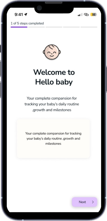
Hello Baby
Designed a mobile app that helps new parents track feeding, sleep, and diaper changes in the unpredictable early months — including UX research, prototyping, and usability testing.
Role
UX/UI Designer
Timeline
neue fische bootcamp, 2025
Tools
Figma, Google Forms, Canva
Team
Individual project
Product Overview
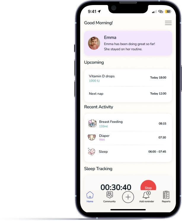
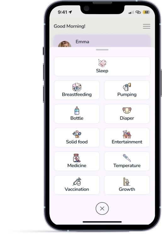
Hello Baby is a simple, intuitive mobile app that helps new parents track feeding, sleep, and diaper changes — especially in the unpredictable early months. With offline access, smart personalization, and easy sharing, it reduces stress and supports coordination so parents can focus on what matters most.
Problem Statement
New parents often struggle to track feeding, sleep, and diapers due to complex apps, limited personalization, and poor offline or sharing features — especially in the exhausting, unpredictable early months with multiple caregivers.
Goals
Design a simple, personalized solution for tracking feeding, sleep, and diapers in the early months, with offline access, easy caregiver sharing, and minimal cognitive load.
Design Process
Empathize
Understand parents' realities
- Surveys
- Observations
- Pain points
Define
Synthesize research into focus
- User persona
- Problem statement
- User stories
Ideate
Explore solutions and structure
- Competitive analysis
- Feature ideas
- User flows
Prototype
Give the ideas form
- Wireframes
- UI kit
- Hi-fi mockups
Test
Validate and refine
- Usability testing
- Feedback analysis
- Iteration
Target Audience
Primary Audience
Modern parents who:
- Use smartphones comfortably
- Track baby's health, sleep, and feeding
- Balance work, parenting, or co-parenting
- Want expert, personalized guidance
- Seek emotional support and time-saving tools
Secondary Audience
- Grandparents and nannies
- Parents of twins or triplets
- Families needing offline access
Competitive Analysis
This chart compares Hello Baby against its competitors — Huckleberry, The Wonder Weeks, and Baby+ — across routine tracking, personalized insights, caregiver sharing, offline access, and developmental milestones. Evaluating each competitor's strengths and gaps reveals where Hello Baby can differentiate and deliver unique value to new parents.
| Feature | Hello Baby | Huckleberry | The Wonder Weeks | Baby+ |
|---|---|---|---|---|
| Sleep tracking | ||||
| Diaper tracking | ||||
| Growth charts | ||||
| Feeding logs | ||||
| Vaccine tracker |
Quantitative Research
Some of the results:
"Which of your baby's activities do you track or log in any way?"
Weight / growth
Milestones
Feeding times / amounts
Sleep duration / times
Diaper changes
Observations
Observation in UX research means watching how users interact with a product to understand their behavior, needs, and pain points — often without interfering.
For Hello Baby, observational research meant watching how parents navigate the app while holding a baby, how easily they find features like feeding logs or sleep tracking, and where they struggle. This gives context to the survey data and uncovers usability issues that users might not report directly.
Pain Points
- Worries whether the baby is sleeping or feeding “enough”
- Finds it hard to remember everything in the middle of the night
- Gets anxious when data is missing or unclear
- Feels overwhelmed when too many features or buttons appear
- Wants help spotting patterns — hard to do when tired or when she forgets to log
- Won't keep using an app that is complicated or unhelpful
User Persona
Maria
"I just want to feel confident and not overwhelmed."
Bio
Maria, a caring first-time mom, relies on trusted digital tools to navigate newborn life with baby Emma. Curious and devoted, she seeks balance, support, and reassurance in every new experience.
Goals
- Track sleep and feeding to understand patterns and feel more in control
- Share caregiving logs with her partner easily
- Get age-based tips so she knows what's next
- Receive helpful reminders
Needs
- A simple and calming interface
- Quick logging with minimal taps
- A sense of community
Personality
User Stories
As a parent of a growing baby, I want the tracking tools to adapt as my baby's needs change, so that I'm always tracking what matters most at each stage.
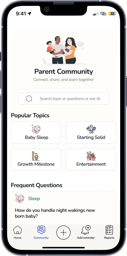
As a parent of a growing baby, I want access to a community that evolves with my child's changing needs, so that I can exchange insights and track the most relevant milestones at each stage.
User Flows
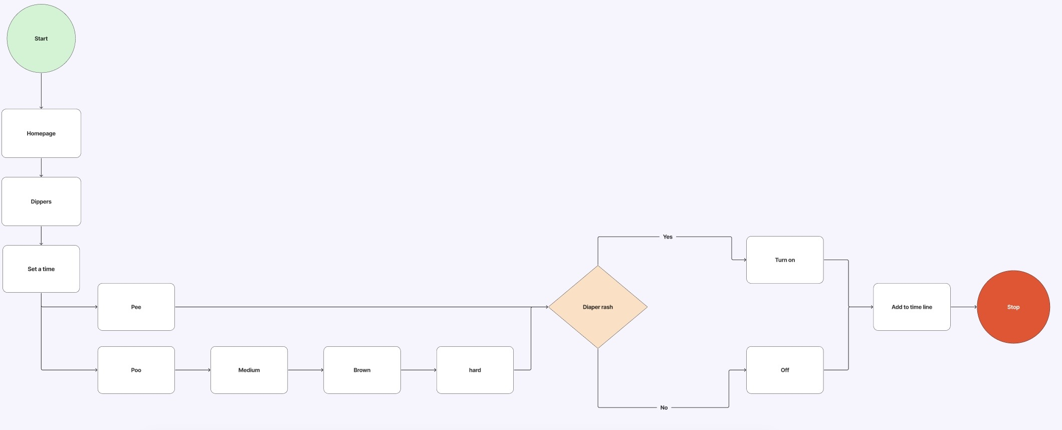
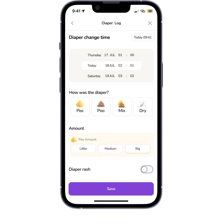
Diaper flow
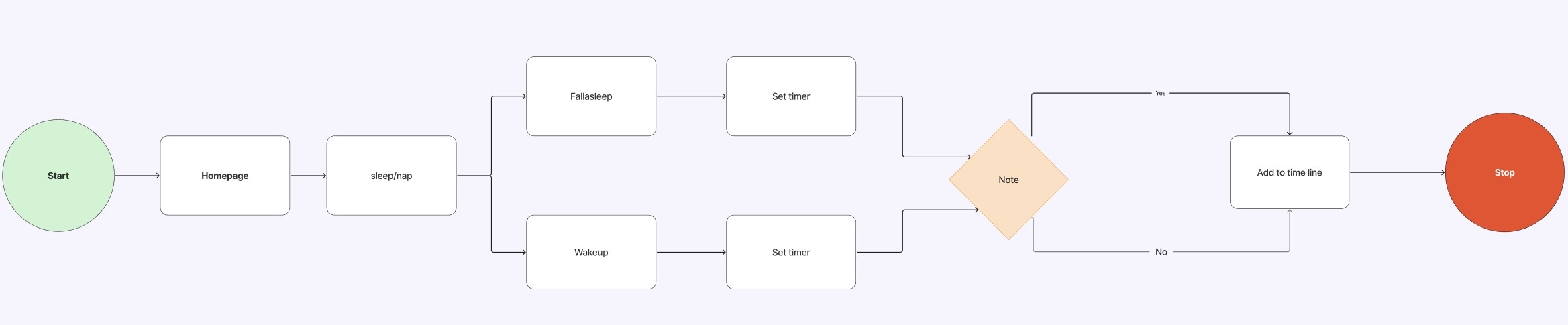
Sleep flow
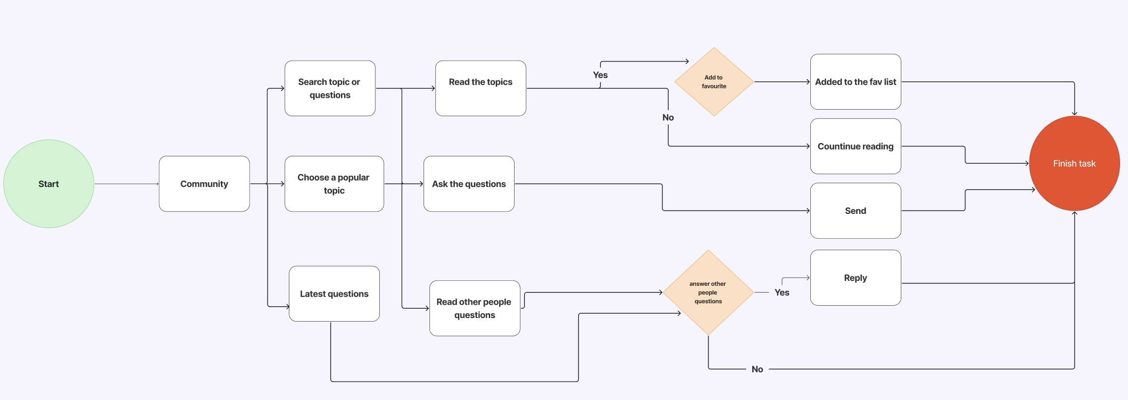
Community flow
UI Design
Nunito Typography
- Modern, friendly, and clean
- Warm and modern — perfect for baby- and family-focused apps
- Easy to read on screens, even at small sizes
- Ideal for UI, headings, and any content that needs a soft, welcoming tone
| Style | Size | Weight | Usage |
|---|---|---|---|
| Display | 28px | Bold | Hero titles, splash |
| Display S | 24px | Bold | App headers |
| Display XS | 20px | Bold | Section headers |
| Title Large | 18px | SemiBold | Supporting headlines |
| Title | 16px | SemiBold | Subheadings, modals |
| Body Large | 16px | Regular | Primary text blocks |
| Body | 14px | Regular | Paragraphs, descriptions |
| Caption | 12px | Regular | Helper text, footnotes |
Color Palette
Primary
Pale Lilac
#E0C3FC
Secondary
Pastel Yellow
#FFE6A3
Accent
Mint Whisper
#B6E1DE
Background
Eggshell
#FFF9F0
Icons
Components
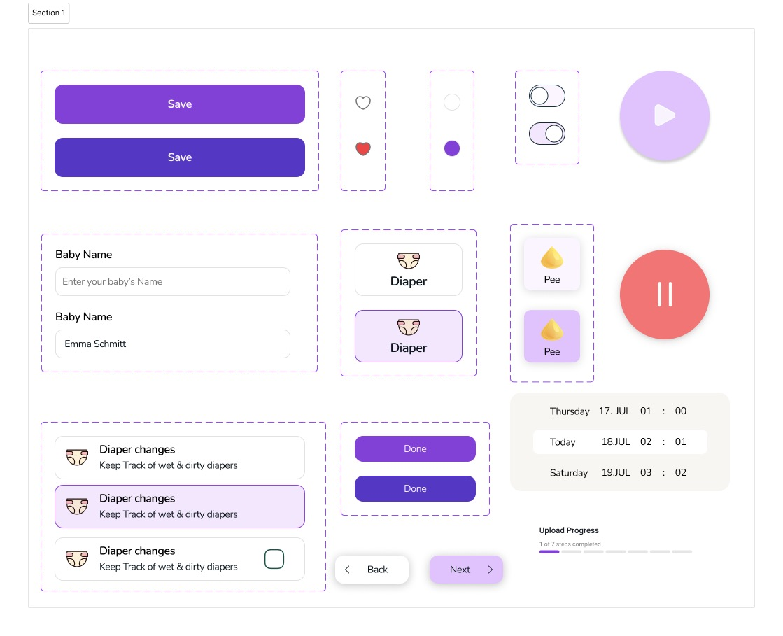
High-Fidelity Mockups
Iteration
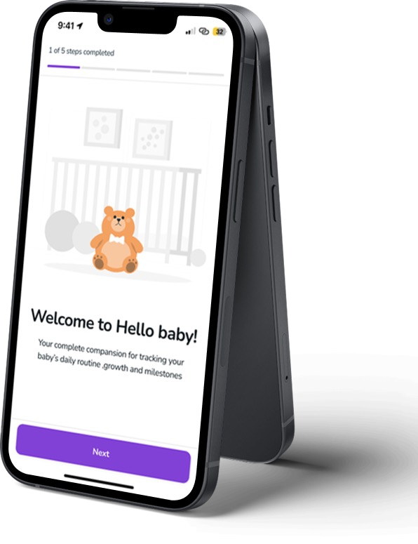
After usability testing, I tweaked the layout, clarified navigation, enlarged buttons for easier tapping, and updated colors for better visibility — making the app feel smoother to use. The onboarding screen is a clear example: a plain icon became a warmer nursery illustration, the copy was resized, and the muted "Next" button became a confident, full-width primary action.
 Before After
 See the full case study
Explore the complete Hello Baby case study, including the full design process, research, and final prototype.
Download PDF Case Study